

The Story of Color: How Paintings Evoke Emotion in a Home
- Beatrice Bodasca
- Nov 6, 2025
- 5 min read
Color is more than a visual experience — it’s an emotional language. Within the walls of a home, colors tell stories, stir memories, and shape the atmosphere of each space. Abstract paintings, with their bold shapes and layered tones, have a unique ability to channel these emotions, transforming interiors into spaces that feel alive, reflective, and deeply personal.
The Emotional Power of Color
Every hue carries its own psychological weight. Red ignites passion and energy. Blue brings calm and focus. Green breathes balance and renewal. When these colors interact on a canvas, they create a silent dialogue that resonates differently with each viewer.
Abstract art, free from literal representation, gives space to this emotional play — allowing color to become the central voice.
A painting can anchor a room’s energy or completely redefine it. Imagine entering a minimalist living space with soft neutral tones — then encountering a vivid artwork that draws the eye and stirs curiosity. In that moment, color becomes not just a visual element, but a feeling that fills the room.
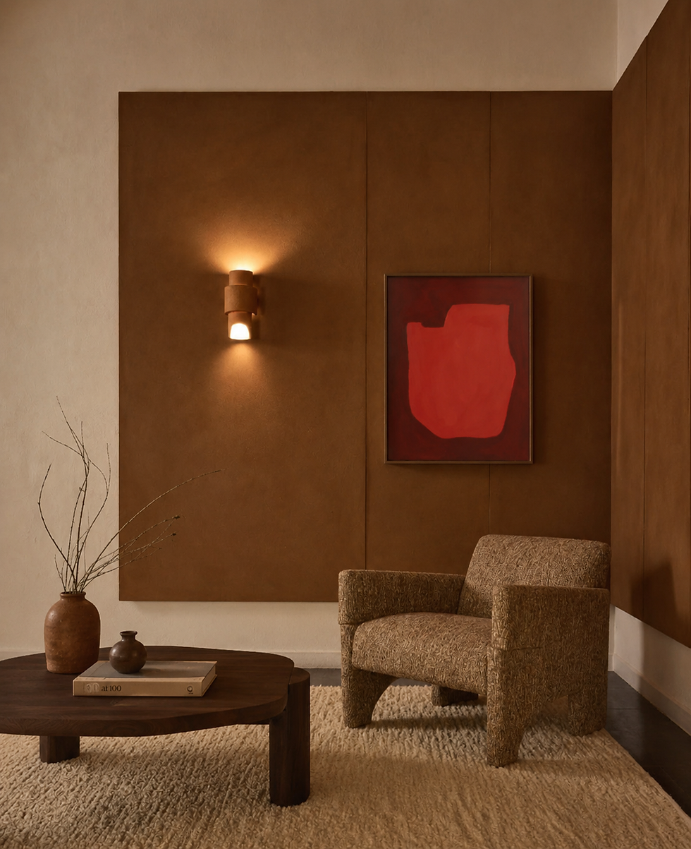
“Bound Forms”: Stillness and Structure in Earthy Tones
One of the clearest examples of emotional depth through simplicity is found in Bound Forms. This piece combines earthy brown, deep black, soft cream, and a vibrant green accent. Its geometry feels grounded, yet alive — as if two forms are held together in quiet conversation. The warmth of the brown evokes stability and comfort, while the contrast of black and cream adds balance and clarity. The touch of green introduces renewal — a quiet reminder of growth within stillness.
Displayed in a contemporary interior, Bound Forms adds a sense of calm structure. It invites contemplation without dominating the space. The viewer feels centered, connected to a more organic, elemental harmony.

“Chaos”: The Beauty of Movement and Contrast
At the other end of the emotional spectrum is Chaos — a bold composition of red, blue, pink, and brown that captures the tension between order and spontaneity. Its fragmented forms and saturated hues create a sense of movement and transformation, reflecting the constant flux of modern life.
The vivid red draws the viewer in with intensity and warmth, while the deep blue introduces cool restraint. These opposing tones meet in a dance that is both energetic and controlled. The painting becomes a metaphor for our inner worlds — structured yet impulsive, thoughtful yet passionate.
Placed in a living room or creative space, Chaos radiates vitality. It becomes a statement piece that energizes its surroundings and sparks conversation, reminding us that emotion and expression are essential parts of a home’s identity.


“Traces of Silence”: When Color Whispers
If Chaos speaks loudly, Traces of Silence whispers. In this work, softer tones of blue and green meet muted neutrals, forming a visual rhythm that feels almost meditative. It embodies the quieter side of emotion — reflection, memory, and peace.
The simplicity of form allows the subtle interplay of colors to lead. Here, green becomes a symbol of serenity and renewal, while blue recalls open skies and deep thought. The result is a painting that doesn’t just decorate a wall but transforms the space into a refuge of calm.
In bedrooms, reading corners, or minimalist interiors, Traces of Silence offers balance and emotional clarity — a visual breath between moments of noise.

Serenity: The Calm Within Complexity
One of the defining pieces of this philosophy is Serenity, a painting that explores balance through contrast. The work merges soft pinks, warm browns, and deep forest greens in bold geometric shapes. Each form seems to lean on the next, evoking both structure and fluidity. The interplay of color here mirrors emotional composure — the feeling of calm that exists even within movement.
In a living space, Serenity radiates a sense of quiet confidence. It’s perfect for rooms designed for reflection — a library corner, a minimalist office, or a reading space flooded with natural light. Its hues complement both neutral palettes and darker tones, blending elegance with grounded energy.


Powerful Alignment: The Energy of Harmony
Powerful Alignment explores the dynamic between order and spontaneity. Its palette of cool blues, earthy greens, and muted grays creates a layered visual rhythm that speaks of strength and flow. The composition’s angular forms evoke alignment — not rigidity, but the balance of forces moving in unison.
Displayed in a modern interior, Powerful Alignment commands attention without overwhelming the space. It invites contemplation, acting as a visual anchor that connects the viewer to a deeper sense of purpose. This artwork transforms a wall into a statement of focus and energy, ideal for creative studios, workspaces, or contemporary lounges.

Curating Emotion Through Color : How Paintings Evoke Emotion in a Home
Choosing art for a home is not just about aesthetic taste; it’s about emotional intention. A collection of abstract paintings can guide the mood of each room — invigorating a dining area with energy, grounding a living space with warmth, or soothing a bedroom with calm tones.
When curating, think of your home as a composition of emotional zones. Which rooms need vitality? Which ones need peace? Color becomes your tool, and paintings are the instruments that play the melody.
Living with Color : How Paintings Evoke Emotion in a Home
To live with color is to live with feeling. Paintings like Bound Forms, Chaos, and Traces of Silence remind us that emotion is not always spoken — sometimes, it’s simply seen and felt. Abstract art offers this unspoken connection, turning walls into mirrors of our inner landscapes.
In a world often filled with noise, the story of color brings us back to what is essential: emotion, balance, and the beauty of presence. Through the right artwork, a home becomes more than a space — it becomes an experience of color and feeling intertwined.
The Emotional Language of Color in Home Design
Every home has its emotional pulse, and art helps reveal it. Warm tones — ochre, rust, sienna — infuse a sense of comfort and intimacy. Cool shades — blue, green, gray — bring clarity and serenity. When curated thoughtfully, a home’s collection of paintings can create an emotional gradient, shifting the mood from one room to another, shaping how people move and feel through the space.
Color also bridges the personal and the architectural. It reflects not only a design choice but also the mindset of those who inhabit the home. Abstract art’s freedom allows for this versatility — each viewer reads emotion differently, which makes each home uniquely alive.
Blending Contemporary and Retro with Colorful Abstract Art
A contemporary interior with retro accents thrives on contrast. Clean lines meet nostalgic textures, minimalist layouts coexist with statement colors. Abstract paintings with bold forms and rich palettes act as the connecting thread between these worlds.
By mixing abstract art with vintage furniture or metallic fixtures, homeowners create depth — a narrative that feels both sophisticated and soulful. The key is in balance: let color guide the eye, let texture ground the scene, and allow art to tell the story of who you are.


Comments